

Amazon's best-selling picture lights now compete on a familiar checklist: rechargeable battery, remote control, dimming, and "3 CCT" — three selectable color temperatures. The feature is everywhere, but the buying advice is not. Which setting actually works for a landscape painting? Is warm always better? And why can a brighter light still make art look dull?
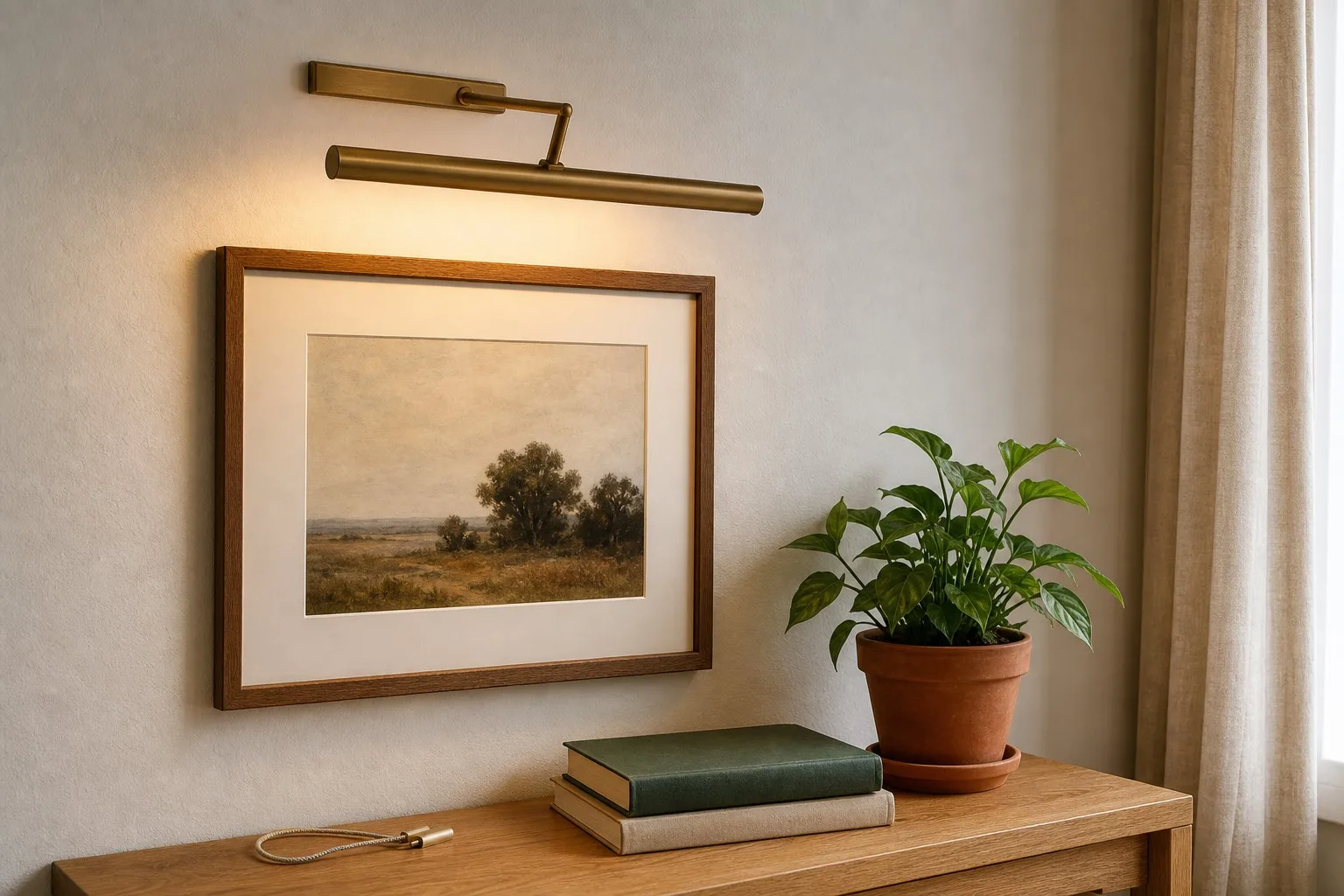
Here is the practical color-temperature guide for choosing a picture light that looks right at breakfast, during dinner, and after the room goes dark.
What Color Temperature Means in a Picture Light
Color temperature is measured in Kelvin (K). Lower numbers look warmer and more amber; higher numbers look cooler and closer to daylight:
- Warm white (about 2700–3000K): candlelight, amber, intimate.
- Neutral white (about 3500–4500K): balanced daylight, clearer whites, more accurate everyday viewing.
- Cool white (about 5000–6000K): crisp and blue-leaning, closer to midday daylight.
Most Amazon listings advertise the number of modes, but the useful question is not "how many?" It is "which mode suits this artwork, room and time of day?"
Warm White: Best for Evening Atmosphere
Choose warm white when your priority is mood. It works especially well with oil paintings, landscapes, wood frames, brass finishes and living rooms that already use warm lamps or cream textiles. A dimmed 2700–3000K setting makes a single artwork feel intentional rather than over-lit.
There is one warning: very warm light can push skin tones orange and make a black-and-white photograph look sepia. If your gallery wall includes family portraits or images with a lot of white, you may want a neutral setting for accurate viewing.
Neutral White: The All-Rounder for Art
Neutral white is the safest starting point when you are not sure. It keeps whites looking cleaner, separates similar colors in a busy gallery wall, and shows the difference between a pale blue and a gray without the strong amber cast of a very warm bulb.
This is also the better choice for artwork that changes function during the day: a print you look at while working, a family photo wall, or a hallway display that needs to read clearly under both daylight and evening ambient light.
Cool White: When Crisp Detail Matters
Cooler settings can help in a bright, modern room with white walls, strong daylight, or artwork that depends on crisp blue and green detail. They are less forgiving in a cozy living room: against warm wood and linen, cool light can feel clinical and can make the rest of the room look yellower by comparison.
Use it selectively rather than assuming the highest Kelvin number is the most professional. The best setting is the one that makes the art clear without fighting the room around it.
Brightness and Color Temperature Work Together
A common mistake is changing color temperature without lowering brightness. A warm setting at maximum output can still create glare on glass, while a neutral setting at a gentle level may be easier to live with. Start at a lower brightness, aim the light slightly toward the art, and increase it only until the darkest detail becomes readable.
Placement matters too: mount the light roughly 6–8 inches above the top edge of the frame, then adjust the head so the beam lands on the artwork rather than directly into the viewer's eyes. For deep frames or layered gallery walls, an adjustable arm makes this angle easier to fine-tune.
Do Not Confuse Brightness with Color Accuracy
Color temperature tells you whether light looks warm or cool. CRI tells you how faithfully it renders color. They are different specifications. A bright, low-CRI light can still make wood, canvas and skin tones look flat or muddy. For art, look for CRI 90+ first, then choose the color temperature that suits your room.
The Practical Three-Setting Routine
- Daytime: start with neutral white at medium brightness and check whites, skin tones and fine detail.
- Early evening: lower the brightness and try warm white to match the room's ambient mood.
- Late evening: keep the warm setting gentle enough to avoid glare; the picture should glow, not look like a spotlight.
For a wireless installation, the Model 270 combines remote-controlled dimming, three color temperatures, a magnetic mount, an adjustable arm and CRI 90+ color rendering. That means you can change the atmosphere without moving the fixture or running a new cable.
One picture. Three moods. No rewiring.
Set a warm evening glow, switch to neutral for accurate detail, or fine-tune brightness from the sofa — with CRI 90+ color rendering and a rechargeable magnetic mount.
Shop the Model 270Rechargeable · Magnetic Mount · CRI 90+ · Free Shipping over $35